Marketing Dashboard
- Ryan Schefke
- Christopher Kipgen (Unlicensed)
Overview
The Dashboard is a central place to add key reports and other data to your view. Dashboards can be personalized with any available widget. Widgets are individual reports, available from the right-hand panel, that can be added to your view.
Understanding the Definition of a Conversion and an Engagement
In general, a Conversion happens when the identification of a person for the first time is attributed to the marketing content. An Engagement happens when there is any interaction with the content. There will only be one marketing content (sales email, video, etc.) that's responsible for a conversion on a prospect; however, there could be multiple engagements for a prospect.
Below is a summary of the exact definition based on marketing content type.
| Conversion | Engagement | |
|---|---|---|
| Webforms | When an anonymous prospect submits a webform with a new email address, thereby identifying the person for the first time. | When any prospect submits a webform, regardless if they are in the system already or not. |
| Landing Pages | When an anonymous prospect submits a webform in a landing page with a new email address, thereby identifying the person for the first time. | When any prospect submits a webform in a landing page, regardless if they are in the system already or not. |
| Sales Emails | When a link is clicked in a sales email and there is no other conversion attributed to the prospect. | Any link click in a sales email. |
| Content | When a prospect submits their email address when downloading a file and the prospect's email was not previously in the system. | When any prospect submits their email address when downloading a file. The system will not prompt the prospect to enter their email again if it has already been collected; however, if the prospect makes another visit from another browser, and enters the same email, this would record an Engagement. |
| Videos | When a prospect submits their email address when watching a video and the prospect's email was not previously in the system. | When any prospect submits their email address when watching a video. The system will not prompt the prospect to enter their email again if it has already been collected; however, if the prospect makes another visit from another browser, and enters the same email, this would record an Engagement. |
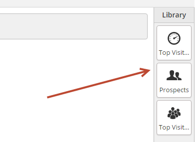
Adding a Reporting Widget
To add a reporting widget select it from the library, located on the right-hand side of the Dashboard. Click the widget or drag and drop it onto the canvas to add it to your view.
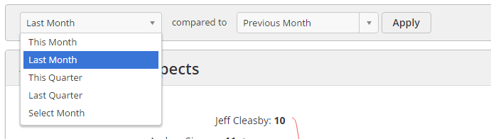
Selecting Time Period Data and Running Comparisons
Select a time period for your reports as well as a comparison period by using the section at the top of the canvas. By default, "This Month" will be selected. Whenever these values are changed the system remembers your settings for the next time you load the page. The time period and comparison period apply to all reporting widgets in the Dashboard. Once you change a value click the Apply button to run your new report.
Reports
We're adding new reporting widgets to the library all the time. If you have any suggestions for new reports don't hesitate to let us know! Below is a summary of all available reports.
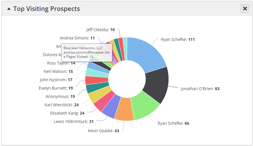
Top Visiting Prospects
Displays a pie graph of the top 20 Known Prospects during the selected time period. A Known Prospect is anyone with an email address in the system. Values shown in the graph are the Prospect's name followed by a number indicating how many total pages they visited during the selected time period.
- Hover over a visitor to see their company name, email address, and Pages Visited as shown below.
- Click on a visitor or portion of the pie graph to open the person's Prospect Profile in a new browser tab.
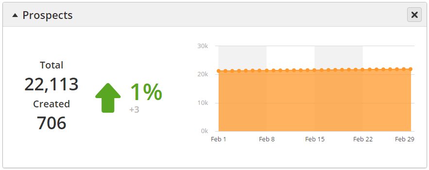
Prospects
Displays an area chart of the number of Prospects in the system at a specific time during the selected time frame. Values are plotted on the area chart over time. A green up arrow indicates a healthy system, wherein you're adding new people to further track, nurture, and engage.
- Total = Total number of Prospects you have in the system.
- Created = New Prospects added to your account during the selected time period.
The arrow, %, and number represent the difference between the total number of Prospects created within the selected time period against the total number of Prospects created within the comparison time period. The actual change is below the percentage. The percentage change is calculated as:
((Prospect created in new period - Prospects created in comparison period) / # of Prospects created within comparison period) x 100
Green indicates values have increased, red indicates values have decreased, and yellow indicates no change.
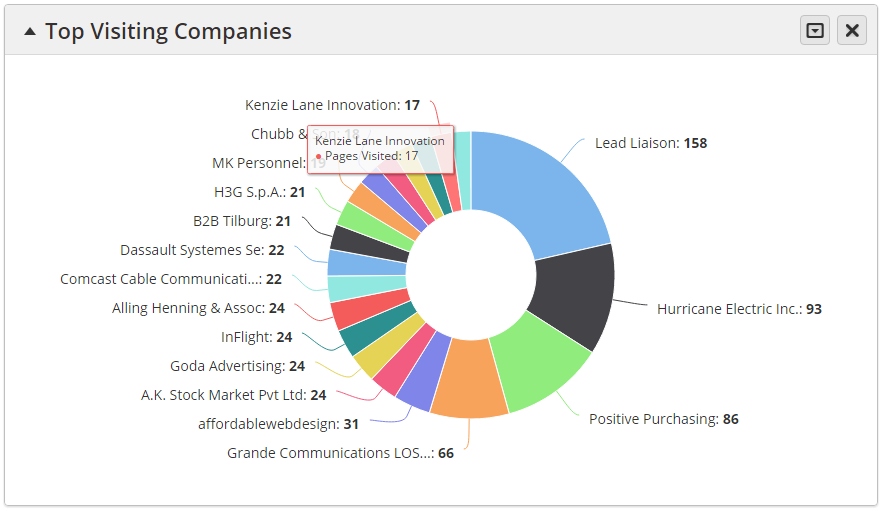
Top Visiting Companies
Displays a pie graph of the top 20 companies that visited your website(s) during the selected time period. Values shown in the graph are the company's name followed by a number indicating how many total pages they visited during the selected time period. Hover over a company to see their company name and Pages Visited as shown below.
Click the down arrow tab as shown below to switch between Companies, ISPs, or everything in the report. Also select/deselect Org Types using the checkboxes toward the bottom.

Here's what the report looks like with Companies selected:
Sales Emails
Display how effective your sales team is doing with email.
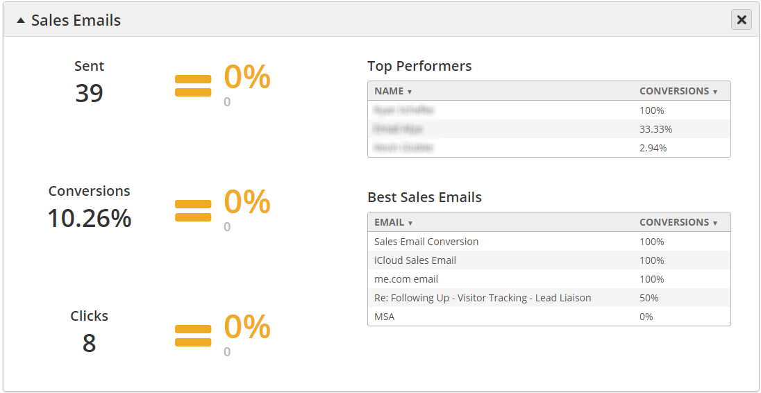
- Sent = Total # of sales emails sent within the selected time period.
- Conversions = Total number of people converted into Prospects from sales emails during the selected time period.
- Clicks = Total number of clicks on sales emails within the selected time period.
- Top Performers = Top salespeople based on conversion of sales emails.
- Best Sales Emails = Top sales emails based on conversions.
- Values in color =
Value = # of sales emails sent/converted/clicked within selected period - # of sales emails sent/converted/clicked within comparison period
Percentage = ((value / # of sales emails sent/converted/clicked within comparison period) x 100)
Green indicates values have increased, red indicates values have decreased, and yellow indicates no change.
Pages
Displays high level statistics on your landing pages.
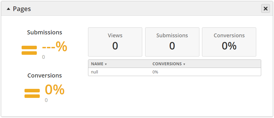
- Submissions
Value = # of submissions within selected period - # of submissions within comparison period
Percentage = (value / # of submissions within comparison period) x 100
- Green indicates values have increased, red indicates values have decreased, and yellow indicates no change.
- Conversions
- Value = # of conversions within selected period - # of conversions within comparison period
- Percentage = ((value / # of conversions within comparison period) x 100)
- Green indicates values have increased, red indicates values have decreased, and yellow indicates no change.
- Views = Total # of landing page views within the selected time period.
- Submissions = Total # of submissions within the selected time period.
- Conversions = Conversion percentage within the selected time period.
- Table of info = Top five landing pages by conversion.
Emails
Displays high level statistics on email performance. These stats are for Marketing Emails. See the Sales Emails section below for more details on Sales Emails.
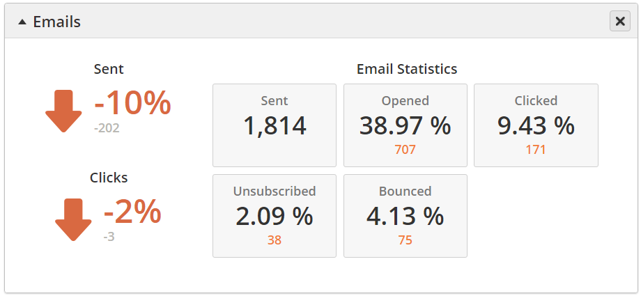
- Sent
Value = # of emails sent within selected period - # of emails sent within comparison period
Percentage = (value / # of emails sent within comparison period) x 100
- Green indicates values have increased, red indicates values have decreased, and yellow indicates no change.
- Clicks
- Value = # of email clicks within selected period - # of email clicks within comparison period
- Percentage = ((value / # of email clicks within comparison period) x 100)
- Green indicates values have increased, red indicates values have decreased, and yellow indicates no change.
- Gray Boxes:
- Sent = Total # of emails sent within the selected time period.
- Opened = Total # of emails opened within the selected time period.
- Clicked = Total # of emails clicked within the selected time period.
- Unsubscribed = Total # of unsubscribes within the selected time period.
- Bounced = Total # of bounces within the selected time period.
Web Forms
Displays high level statistics on your web forms.

- Submissions
Value = # of submissions within selected period - # of submissions within comparison period
Percentage = (value / # of submissions within comparison period) x 100
- Green indicates values have increased, red indicates values have decreased, and yellow indicates no change.
- Conversions
- Value = # of conversions within selected period - # of conversions within comparison period
- Percentage = ((value / # of conversions within comparison period) x 100)
- Green indicates values have increased, red indicates values have decreased, and yellow indicates no change.
- Views = Total # of webform views within the selected time period.
- Submissions = Total # of webform submissions within the selected time period.
- Conversions = Conversion percentage within the selected time period.
- Table of info = Top five webforms by conversion.
Marketing Calendar
The marketing calendar allows team members to keep track of and share multiple marketing activities, such as web meeting events, planned social media posts, scheduled emails, as well as custom events. Learn more about the marketing calendar here.
Videos
Displays high level statistics on your videos.
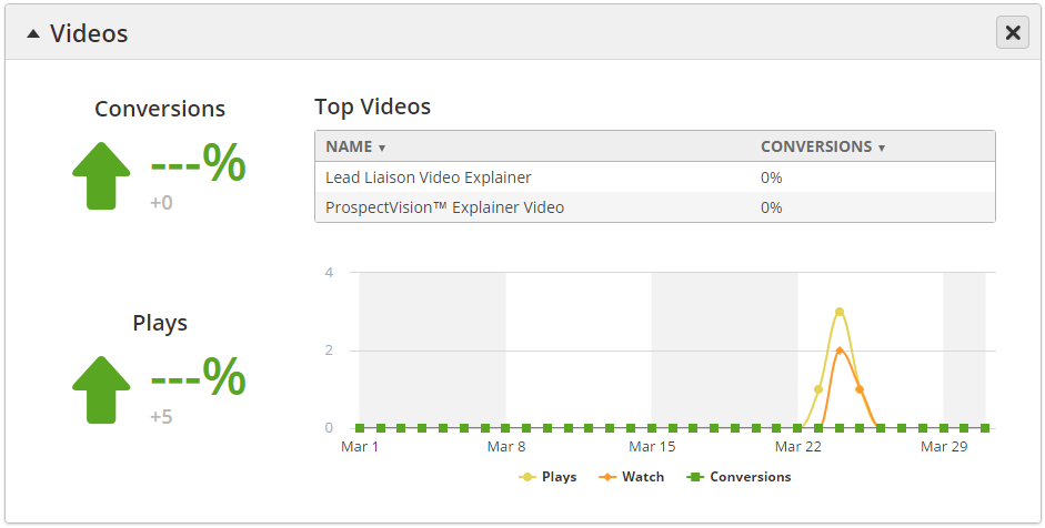
- Plays
Value = # of plays within selected period - # of plays within comparison period
Percentage = (value / # of plays within comparison period) x 100
- Green indicates values have increased, red indicates values have decreased, and yellow indicates no change.
- Conversions
- Value = # of conversions within selected period - # of conversions within comparison period
- Percentage = ((value / # of conversions within comparison period) x 100)
- Green indicates values have increased, red indicates values have decreased, and yellow indicates no change.
- Graph = Displays total number of plays, watches, and conversions by day.
- Table of info = Top five videos by conversion.
Content (Trackable Content)
Displays high level statistics on your Trackable Content.
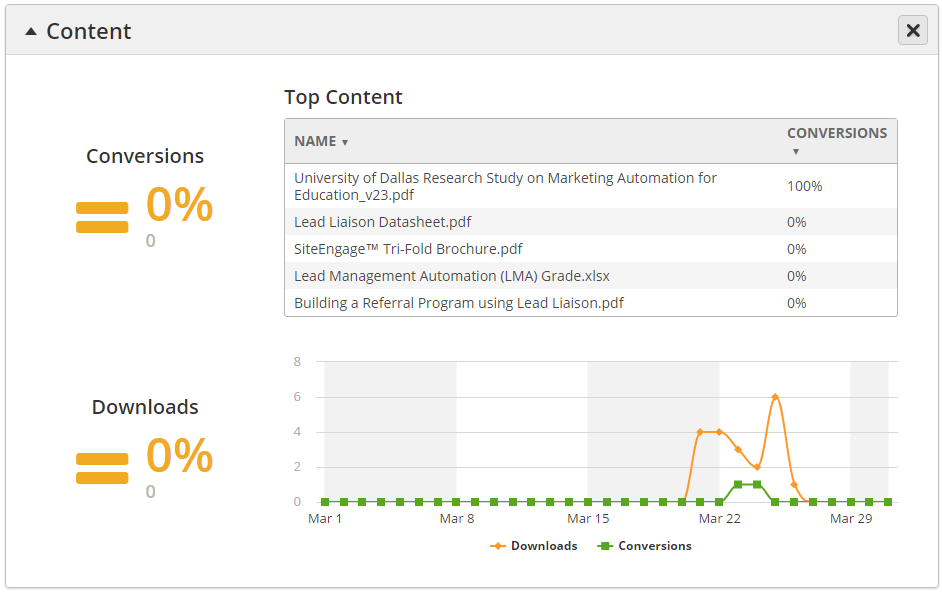
- Downloads
Value = # of downloads within selected period - # of downloads within comparison period
Percentage = (value / # of downloads within comparison period) x 100
- Green indicates values have increased, red indicates values have decreased, and yellow indicates no change.
- Conversions
- Value = # of conversions within selected period - # of conversions within comparison period
- Percentage = ((value / # of conversions within comparison period) x 100)
- Green indicates values have increased, red indicates values have decreased, and yellow indicates no change.
- Graph = Displays total number of downloads and conversions by day.
- Table of info = Top five Trackable Content by conversion.
Engagement
Displays high level statistics on how effective you are at engaging your audience.
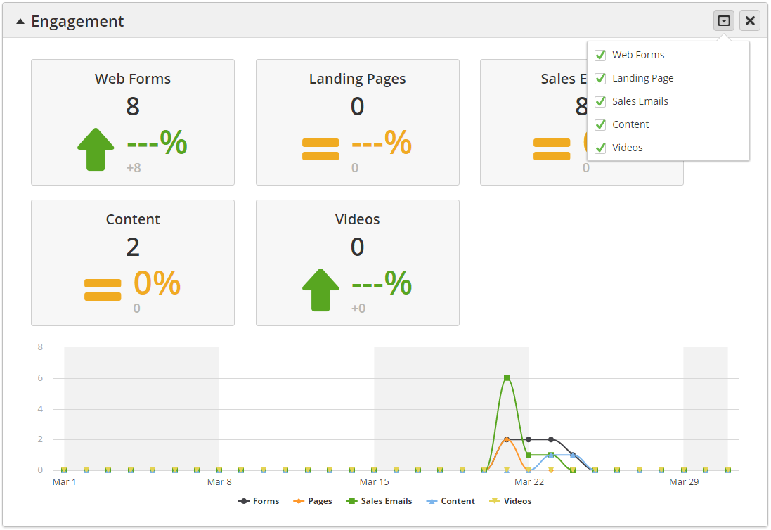
- Web Forms
- Value in black = # of submissions within selected period
- Percentage = ((value / # of submissions within comparison period) x 100)
- Green indicates values have increased, red indicates values have decreased, and yellow indicates no change.
- Landing Pages
- Value in black = # of pages with a web form that have been submitted within selected period
- Percentage = ((value / # of submissions within comparison period) x 100)
- Green indicates values have increased, red indicates values have decreased, and yellow indicates no change.
- Sales Emails
- Value in black = # of sales emails clicked within selected period
- Percentage = ((value / # of sales email clicks within comparison period) x 100)
- Green indicates values have increased, red indicates values have decreased, and yellow indicates no change.
- Content (Trackable Content)
- Value in black = # of times a Prospect has entered their email address within selected period
- Percentage = ((value / # of times a Prospect has entered their email address within comparison period) x 100)
- Green indicates values have increased, red indicates values have decreased, and yellow indicates no change.
- Videos
- Value in black = # of times a Prospect has entered their email address within selected period
- Percentage = ((value / # of times a Prospect has entered their email address within comparison period) x 100)
- Green indicates values have increased, red indicates values have decreased, and yellow indicates no change.
- Table of info = Displays web form, landing page, sales email, trackable content, and video engagement levels by date.
Conversions
Displays high level statistics on how effective you are at converting website visitors.
Understanding Conversions
A conversion is when someone goes from Anonymous to Known. For example, a conversion from a Web Form happens when an Anonymous Prospect submits a form, subsequently identifying them with their email. That counts as a conversion. However, if a Known Prospect submits the form (someone who we already have an email address for) then this is not a Web Form conversion.
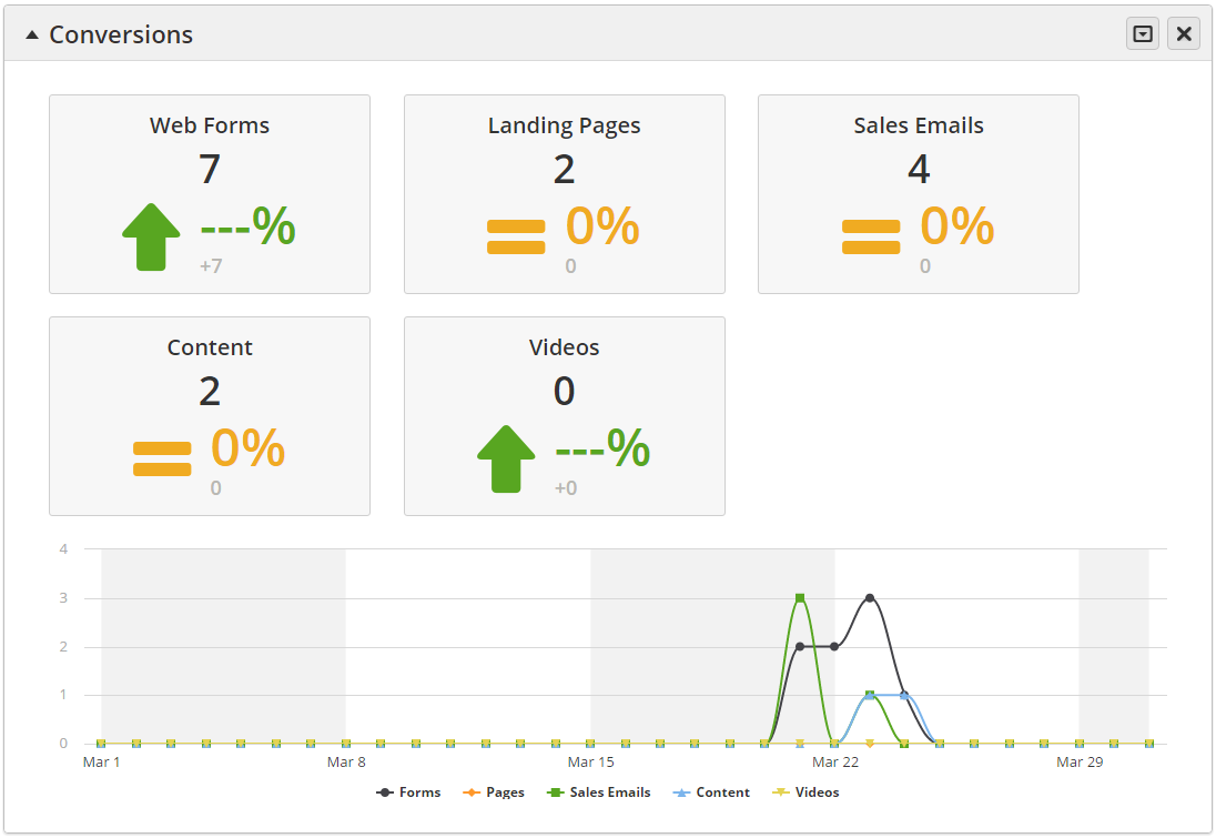
- Web Forms
- Value in black = # of conversions within selected period
- Percentage = ((value / # of conversions within comparison period) x 100)
- Green indicates values have increased, red indicates values have decreased, and yellow indicates no change.
- Landing Pages
- Value in black = # of pages with a web form that have created conversions within selected period
- Percentage = ((value / # of submissions within comparison period) x 100)
- Green indicates values have increased, red indicates values have decreased, and yellow indicates no change.
- Sales Emails
- Value in black = # of sales emails that created conversions within selected period
- Percentage = ((value / # of sales email clicks that created conversions within comparison period) x 100)
- Green indicates values have increased, red indicates values have decreased, and yellow indicates no change.
- Content (Trackable Content)
- Value in black = # of times trackable content has created conversions within selected period
- Percentage = ((value / # of times trackable content has created conversions within comparison period) x 100)
- Green indicates values have increased, red indicates values have decreased, and yellow indicates no change.
- Videos
- Value in black = # of times a video has created conversions within selected period
- Percentage = ((value / # of times a video has created conversions within comparison period) x 100)
- Green indicates values have increased, red indicates values have decreased, and yellow indicates no change.
- Table of info = Displays web form, landing page, sales email, trackable content, and video conversions by date.
Performance
Displays high level statistics on how you're doing with your sales and marketing efforts, includes key statistics such as new Prospects, conversions, and overall engagement.
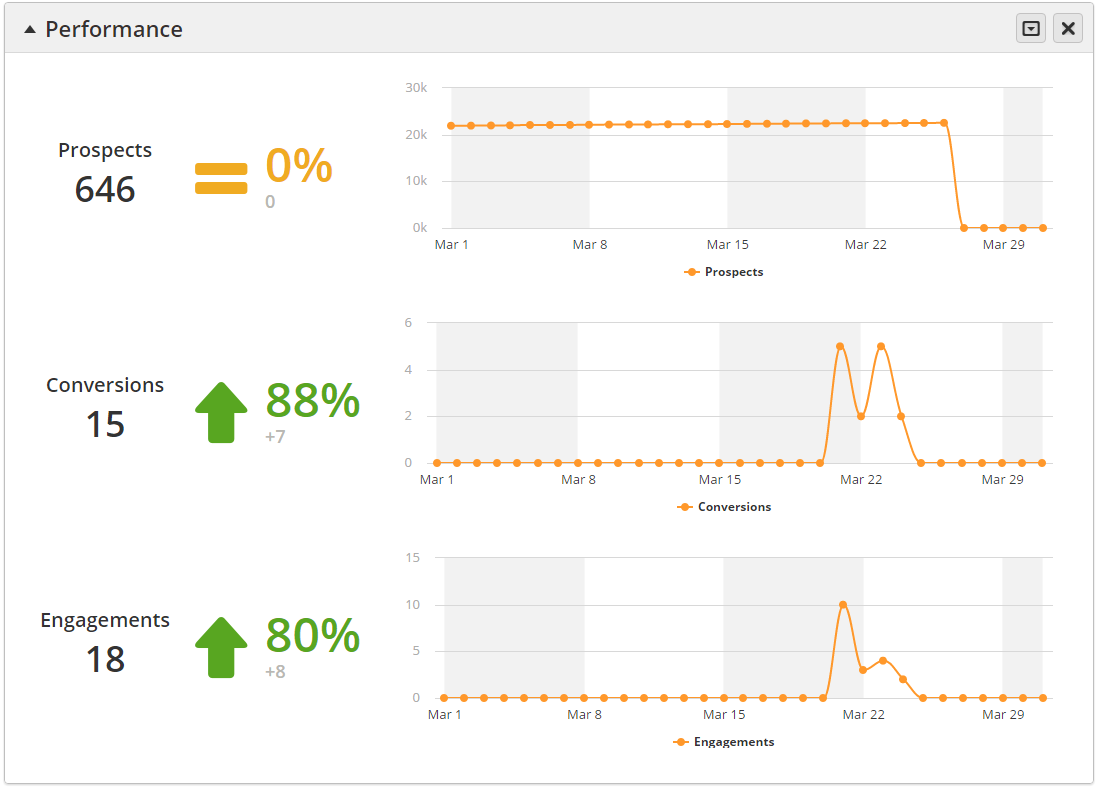
- Prospects
- Value in black = # of Prospects created within selected period
- Percentage = ((value / # of Prospects created within comparison period) x 100)
- Green indicates values have increased, red indicates values have decreased, and yellow indicates no change.
- Conversions
- Value in black = # of conversions within selected period
- Percentage = ((value / # of conversions within comparison period) x 100)
- Green indicates values have increased, red indicates values have decreased, and yellow indicates no change.
- Engagements
- Value in black = # of engagements within selected period
- Percentage = ((value / # of engagements within comparison period) x 100)
- Green indicates values have increased, red indicates values have decreased, and yellow indicates no change.
Social Media
Displays high level statistics on how you're doing with your sales and marketing efforts, includes key statistics such as new Prospects, conversions, and overall engagement.
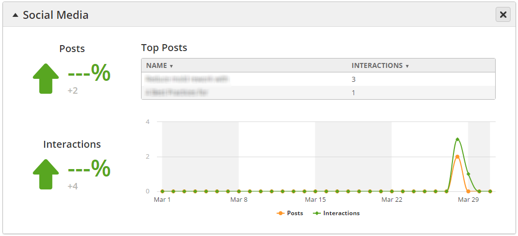
- Posts
Value = Total # of social posts, for example, if the same message was posted to Facebook, Twitter, and LinkedIn then this would count as three (3) posts.
Percentage = (value / # of posts within comparison period) x 100
- Green indicates values have increased, red indicates values have decreased, and yellow indicates no change.
- Interactions
Value = Total # of clicks on your social posts.
Percentage = (value / # of clicks within comparison period) x 100
- Green indicates values have increased, red indicates values have decreased, and yellow indicates no change.
Surveys
Displays high level statistics on survey activity.
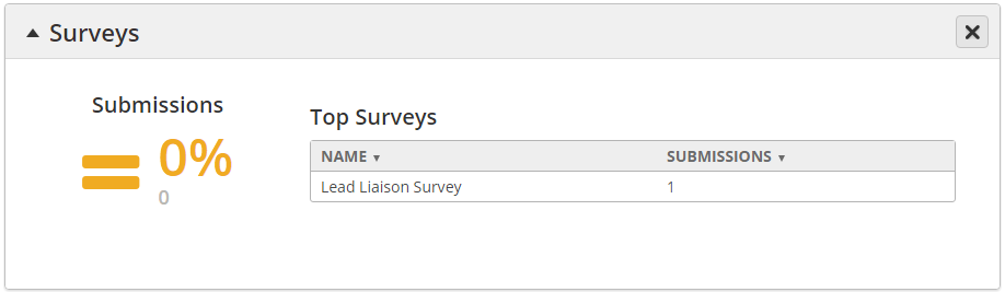
- Submissions
Value = # of survey submissions within selected period
Percentage = (value / # of survey submissions within comparison period) x 100
- Green indicates values have increased, red indicates values have decreased, and yellow indicates no change.
- Table of info = Displays top surveys by # of submissions.
Personalizations
Displays high level statistics on Personalizations. Multiple Dialogs could use one Personalization, which is why statistics for Personalizations are provided separate from Dialogs.

- Submissions
Value = # of Dialogs submitted within selected period
Percentage = (value / # of Dialog submissions within comparison period) x 100
- Green indicates values have increased, red indicates values have decreased, and yellow indicates no change.
- Views
Value = # of Dialogs viewed within selected period
Percentage = (value / # of Dialog views within comparison period) x 100
- Green indicates values have increased, red indicates values have decreased, and yellow indicates no change.
- Table of info = Displays top Personalizations by # of submissions.
Dialogs
Displays high level statistics on Dialogs.
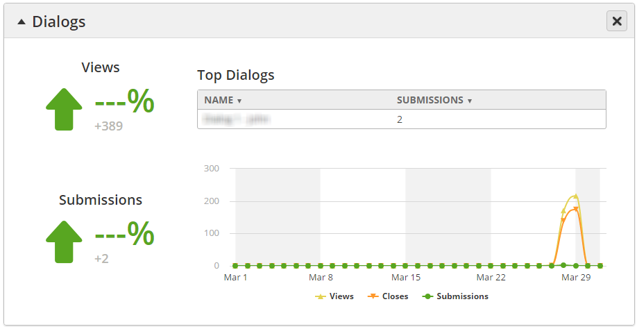
- Submissions
Value = # of Dialogs submitted within selected period
Percentage = (value / # of Dialog submissions within comparison period) x 100
- Green indicates values have increased, red indicates values have decreased, and yellow indicates no change.
- Views
Value = # of Dialogs viewed within selected period
Percentage = (value / # of Dialog views within comparison period) x 100
- Green indicates values have increased, red indicates values have decreased, and yellow indicates no change.
- Table of info = Displays top Dialogs by # of submissions.
Related content
![]()
© 2021 Lead Liaison, LLC. All rights reserved.
13101 Preston Road Ste 110 – 159 Dallas, TX 75240 | T 888.895.3237 | F 630.566.8107 www.leadliaison.com | Privacy Policy