...
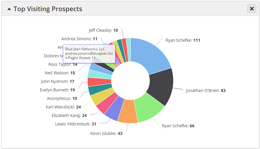
Displays a pie graph of the top 20 Known Prospects during the selected time period. A Known Prospect is anyone with an email address in the system. Values shown in the graph are the Prospect's name followed by a number indicating how many total pages they visited during the selected time period.
- Hover over a visitor to see their company name, email address, and Pages Visited as shown below.
- Click on a visitor or portion of the pie graph to open the person's Prospect Profile in a new browser tab.
Prospects
Displays an area chart of the number of Prospects in the system at a specific time during the selected time frame. Values are plotted on the area chart over time. A green up arrow indicates a healthy system, wherein you're adding new people to further track, nurture, and engage.
...
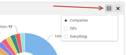
Click the down arrow tab as shown below to switch between Companies, ISPs, or everything in the report. Also select/deselect Org Types using the checkboxes toward the bottom.
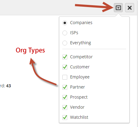
Here's what the report looks like with Companies selected:
...