...
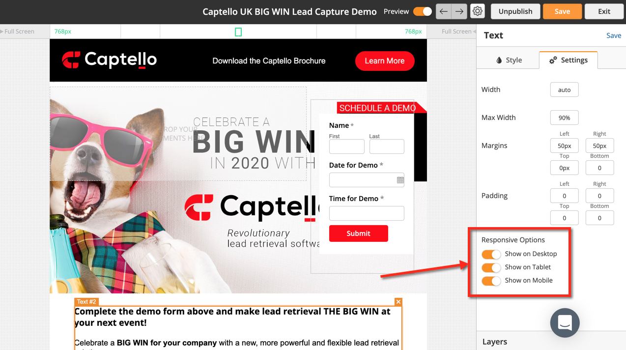
All landing page are mobile responsive to optimize display on desktop, tablet, and mobile devices. Every element (Containers, Images, etc.) has Responsive Options. You can choose to show the element on desktops, tablets, and/or mobile devices on an element by element basis. To change the responsive options click on the element then click the Settings tab and look for the Responsive Options section.
Restricting Max Width
To limit the width of your page to a certain size, while keeping the page responsive for screen sizes smaller than your maximum width, use containers and the Max Width parameter. The two videos below show alternative ways to set your page max width:
- Option 1: Wrap all the blocks in one container:
| Widget Connector | ||
|---|---|---|
|
- Option 2: Set a maximum width for each block. Wrap some blocks in a single container, if they have a common background:
| Widget Connector | ||
|---|---|---|
|
Multi-Variant Testing
The landing page builder supports multiple page variants, not just A/B tests. A, B, C, D, and so on...variations can be created. To create a variant do the following:
...